The Daily Meal
If you love food, this is your place.
Here at the Daily Meal magazine we are three food lovers who share a passion for cooking...and eating! Explore the history, the cultural differences, and the sustainability, health and global warming aspects regarding three of the most delicious and internationalized food in the world. Go to the second page to find out more about our tasty issues.
The Daily Meal is not just a simple magazine about food. Thanks to our style timeline, the user can travel through time, discovering the layout differences, typography changes and tendencies among different historical periods. Explore our documentation to see in detail our design choices!
Finally, the metadata viewer in our issues section enable the user to overview the relevant data and metadata and scroll to the relevant part of each article. The metadata is issue-specific, article-specific and fragment-specific. The user is able also to access the items through a reverse search: clicking on a name in the text scrolls the table to show all the instances of the same name. Take a look and enjoy the reading!
Documentation
Markup
We started with the creation of a solid hierarchical structure for our articles, composed of parts and subparts, according to the HTML elements, tags, and attributes. We created common classes to enable interoperability between different styles, and id for specific cases.
Then, we replaced complex characters and diacritical marks in readable HTML entities. Once the content was readable and structured, we marked up our articles by identifying all the elements semantically significant in the context of our issues.
We individuated persons, places, organizations or companies, food and components, and some specific metadata depending on the issue. Each element was therefore assigned to one or more classes, and detectable by the attribute "about", which we used to collect all elements of the same class and value, linking them to the checkboxes of our metadata panel to guarantee an efficient search.
Styles
Medieval Style
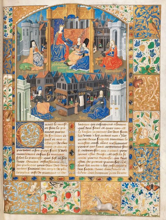
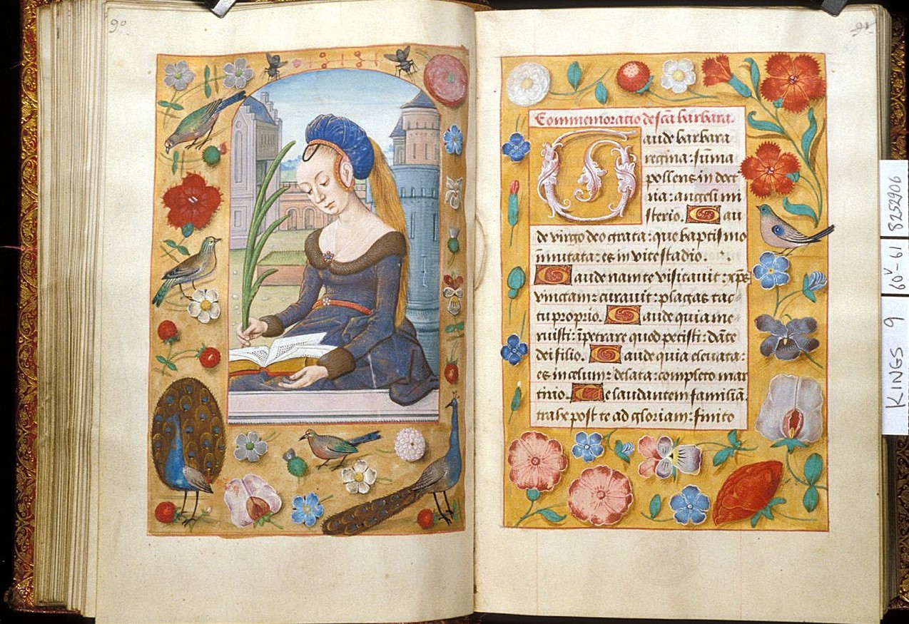
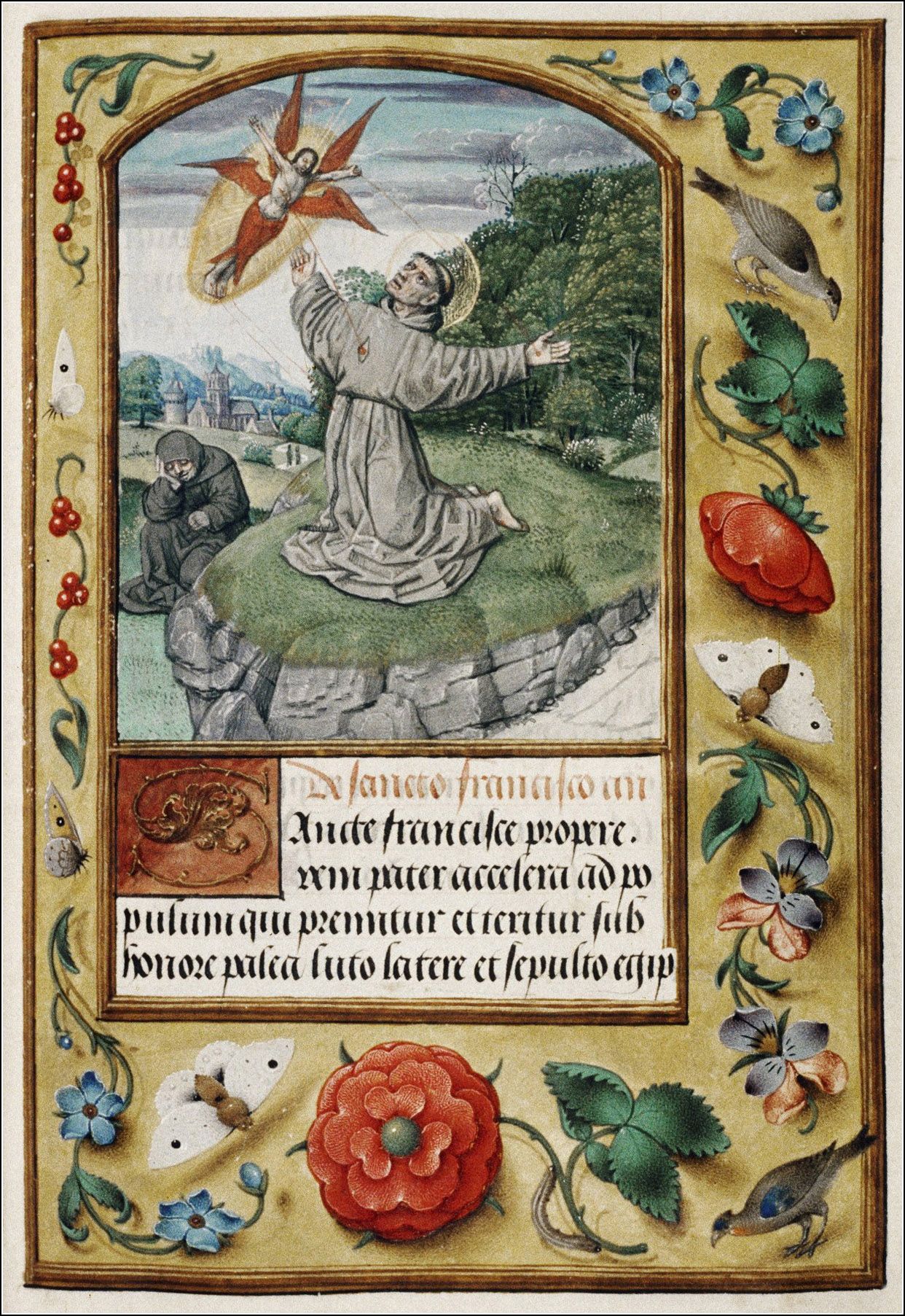
To recreate the style of the 15th century manuscript, we chose to take inspiration from several manuscripts decorated with illuminations at that period in Europe. The illuminations on Medieval manuscripts were used to bring emphasis on the text content and pleasant visual support, as well as enhancing the manuscript's value. It could be used to showcase the importance of the person that had commissioned the book, since highly decorated manuscripts costed more, because of the pigments, the gold and the time spent on working on the manuscript.
Fonts
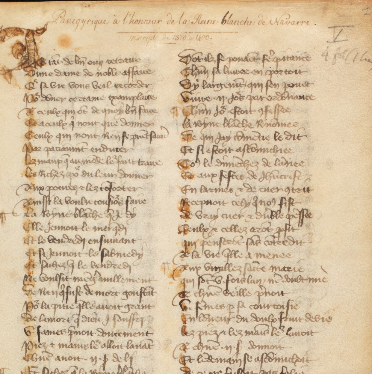
Among the free medieval fonts we found, Hentimps Circlet was the one closest to our images of reference, whereas for the first letter of each paragraph as well as the headings, we used the Mayflower Antique font. Finally, for the metadata panel heading, we used Adine-Kirnberg Regular, to recreate the handwriting of an archivist. Indeed, archivists commonly wrote on the first folio of a manuscript its title, which wasn't necessarily specified in the content, or some additional information such as the estimated date. The reference image taken from the Burgerbibliothek in Bern illustrates it well.
Layout
Taking inspiration from several pictures of illuminated manuscripts from the end of the 15th Century, we recreated the thinner border on the internal side and larger border on the external one (on our website, we would be on the left page of a beautiful illuminated manuscript). The background is an image of a parchment paper.
The titles are centered and in capital red letters; the initial letter of each paragraph alternates between blue and red and the drop cap takes the space of three lines. We chose an interline of 1.2em to respect the ratio found on most of our reference photos. We inserted an image at the beginning of each paragraph, with a rounded top border, to imitate what can be usually found on a double page.
Colors
A lot of the graphical elements for the medieval style were directly taken from images, so we only had to choose colors for the writings and decided to use a brown recalling the ink on the manuscripts, and the red and blue similar to the pigments of the 15th Century.
Belle Époque style
For the typographical implementation of the XIX century, we decided to follow one of the most decorated and beautiful style born approaching the end of the XIX century: La Belle Époque.
This style, mostly spread with some beautiful posters, had its interesting manifestation also in the tradition of the first magazines of the history. It was a period of French and European history, dated between 1871–80 and the outbreak of World War I in 1914. It was a period characterized by optimism, regional peace, economic prosperity and many innovations. Arts markedly flourished, with numerous masterpieces of literature, music, theatre, and visual art gaining extensive recognition.
The reference magazine
This epoch saw the birth of several new magazines, addressing many different subjects of interest for the emerging society. One of the most widespread tradition born during this period was the fashion magazine in Europe.
We decided to take as reference one important fashion magazine at the time in Italy, published in Naples between the end of the 1800s and the beginning of the 1900s. The inspiration from this journal was given by the possibility of making some reasearches on its layout also in the Archiginnasio Library of Bologna, still hosting some copies of it, and due to its richness in decorations, rendering the idea of the spirit of the period itself.
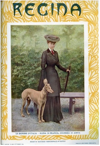
The magazine is named “Regina: rivista per le signore e le signorine” and it was characterized by an elegant pagination, with rich illustrations and liberty frizies, it offered to its public a large variety of insights concerning culture, art, fashion and free time.
It started as fortnightly and then turned into a monthly magazine: all covers were devoted to famous women of the time. One merit of this magazine is to have promoted and introduced concepts regarding women’s emancipation. Printed on "luxury paper", it contains illustrations in both black and white and color, made in Rome in a Neapolitan zincography set up specifically for "Regina". The printing is entrusted to the Pierro printing press which merges, specifically for the magazine, new typographical characters.
Director, throughout the period of publication, is Carlo Crocco Egineta and among the collaborators we find names such as Pascoli, D'Annunzio, Beltramelli and Di Giacomo. "Regina" was born under the sign of the sentimental and professional separation between Matilde Serao and Edoardo Scarfoglio. Here some reference images showing the idea we tried to render for this historical period.
Fonts
We decided to render the typographical richness of the fonts used within the magazine also in our journal page, merging different styles for titles, body, metadata viewer and the navbar, always referring to the art nouveau’s tradition. Here some examples of this characteristic.
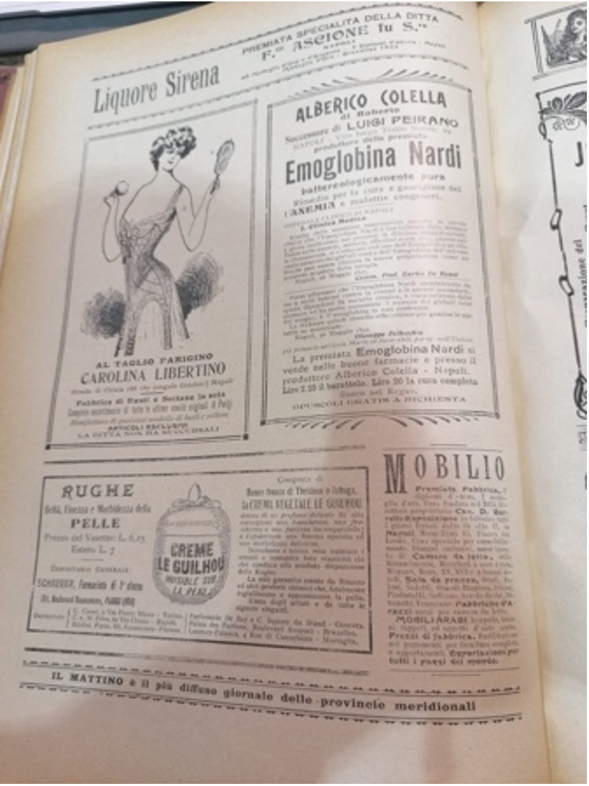
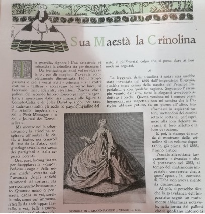
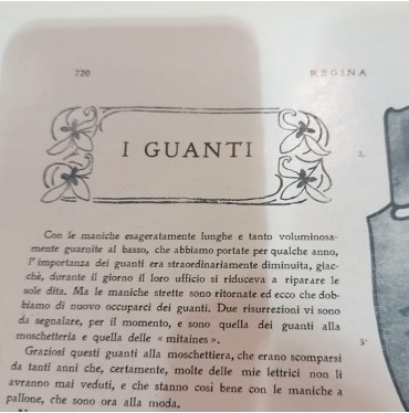
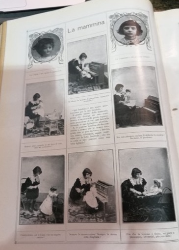
For the titles in the journal page we chose to use the typical Belle Époque font Boecklins Universe within the journal page, similar to the style of some advertisements within the magazine. Due to the creation of a new typographical font for this journal we tried to find a similar one for the body part of the various paragraphs and we chose to use Glass Antiqua, that with its fairy-tail style recalls the article about crinoline.
For each first letter of every paragraph, we used a decorated font with rounded square borders and some decorations inside it as in the image, occupying a line-height of three lines, named Kramer. Then for the opening bar of the metadata viewer the Armoire font, similar to the titles between double borders within the principal pages. Moreover, the decision of using many borders is the result of this practice inside the magazine, which used mostly double border around photos, captions and sometime paragraphs.
There were a lot of elegant decorations inside the magazine that we tried to convey inside our layout for some titles such as the metadata inside the metadata viewer or the team cover page and for the principal cover page which is enriched with a sticker of some decorated flowers from the art nouveau tradition.
Here are reported some reference examples of how we chose to represent the team page inside green boxes with images inside some ellipse and the description below into a smaller rectangular container.
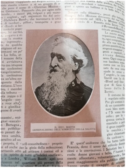
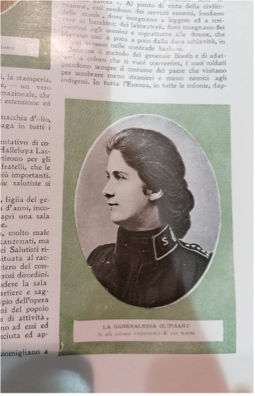
For the fonts we used the references from the issues inside the Archiginnasio, referring to years 1904 and 1907. The most similar font we found for the main title of the cover page was Art Nouveau Café, without any text shadow as the reference images show. Due to the richness in the typographical choices of the journal we chose to use another font in the carousel page, named Legrand, also coming from the Belle Époque period.
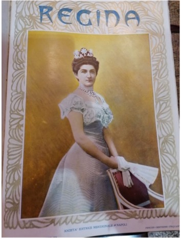
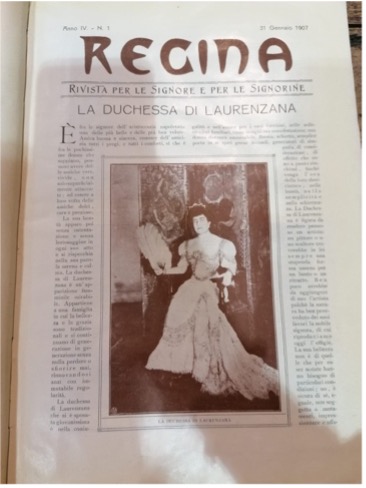
Layout
Inside the journal page the idea was to render this concept of luxury and richness, with elegant decorations and we tried to be as consistent as possible by modifying the images with a grayscale filter of 85% and adding a double border together with some padding inside.
Concerning the cover page, with the decorated borders in pink we tried to render the cover of the magazine always characterized by those classy friezes and a thick border containing images, this space was used for the main title of our journal page.
They are the result of the suggestion of the elegant covers of the magazine, the one used for our journal was taken due to its similarity to those two, shown before in the documentation.
We decided to mantain the decorated margins - occupying 7% of the body space - both in the cover and in the article page for two reasons: first of all for maintaining the style identity between the two main parts of the project and then because in this way the layout page with the "fictitious paper" would be equal in size and margins anywhere.
Colors
Basing on the visible colors inside the 1904 and 1907's editions we decided to use the following set of colors for this style.
Bauhaus style
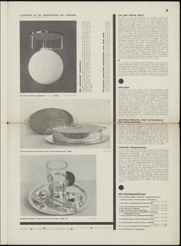
Initially born as a school of art in 1919 in Weimar, the Bauhaus later became an artistic movement based on the merge of arts and crafts. In the treatise written by Mogoly-Nagy for the 1923’s Bauhaus exhibition in Weimar, the features of the new typography are clearly described. The main nature of the new typography is to experience simultaneously the vision of elements and their communication intents. Since communication and legibility are not a priori features of typography aesthetics, the priority is the absolute clarity of whatever will be the typographic composition. The latter may include the use of all linear directions in addition to the horizontal one, colors, type sizes, geometric forms, all to create a flexible and expressive typographical language.
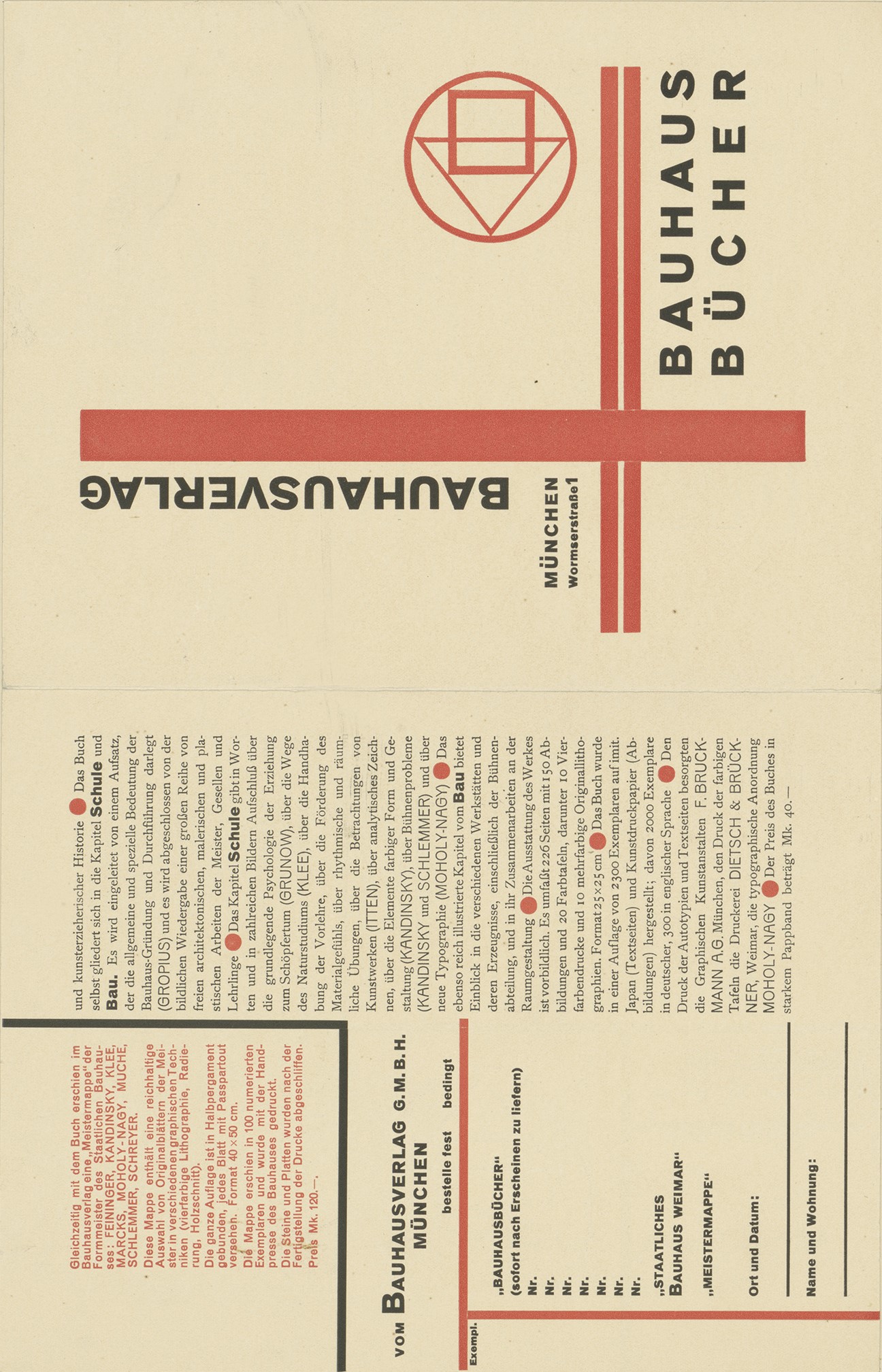
Bauhaus magazines and books were often written in sans-serif fonts, the text often justified fills the columns with larger spaces between words and characters. Furthermore, there was more contrast between different text dimensions, to establish a visual hierarchy: lines, bars, circles, and squares were used to divide the space and guide the viewer across the composition. Finally, they often used elementary shapes harmonically balanced and few colors where black is always present.
Fonts
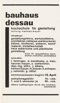
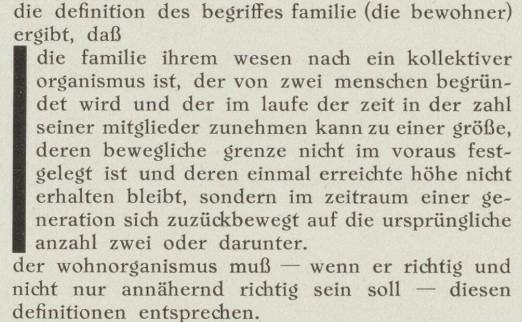
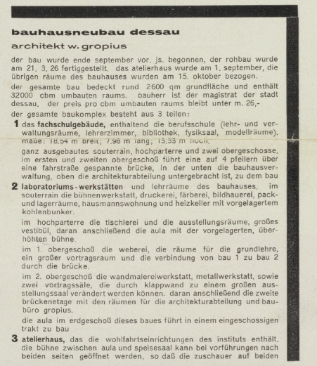
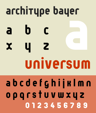
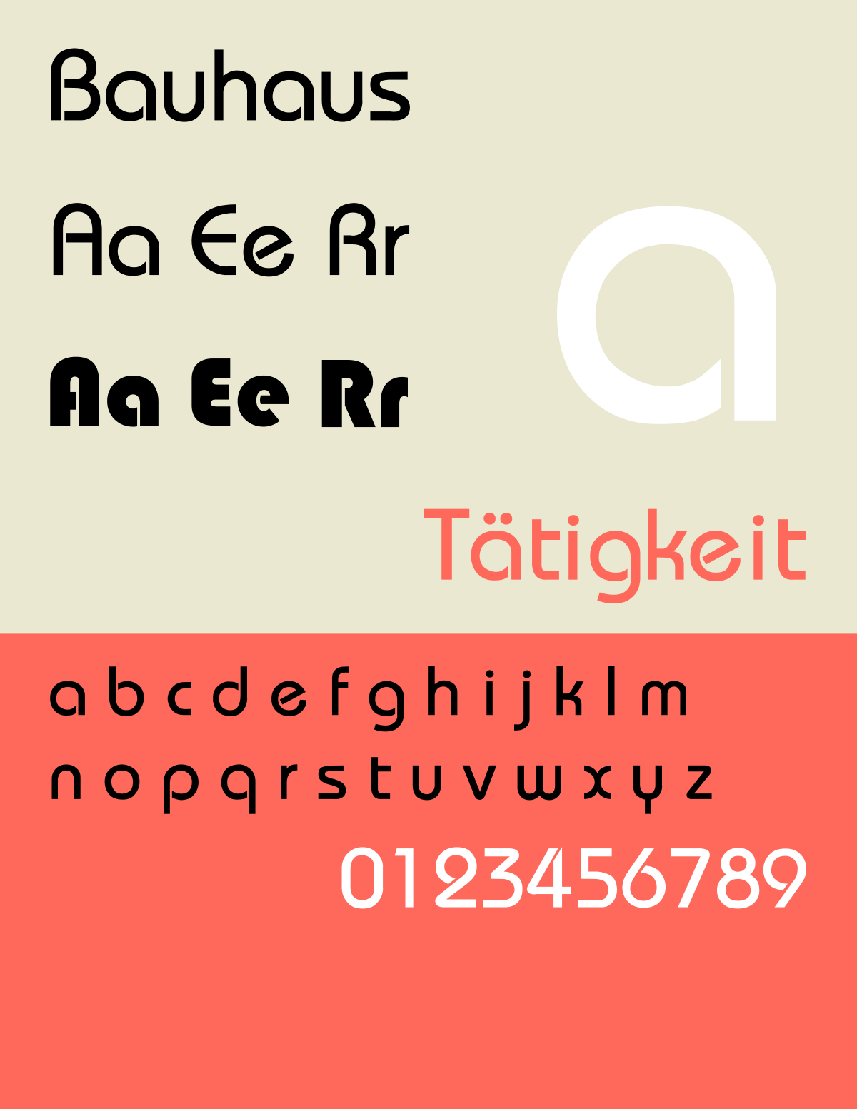
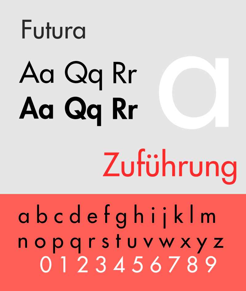
In the 20s the Bauhaus typographers published: We write everything in lower case to have time, and besides, why two alphabets, were one will do? why use capital letters if we don't use them when we speak? The Bauhaus decided to represent the logic of the new industrial deleting the capital letters and any kind of grazie from characters. The new typographical standard was based on a new functional font, free from restrictions and conventions, created by Herbert Bayer in 1925, and commissioned by Walter Gropius. The result was an idealist typeface called “Universal”, a geometric sans-serif font representing the idea of a shape that follows its specific function, observing the main Bauhaus principles. We found a similar font called “Bauhaus” designed by John Taylor, used for the titles, nav, and subtitles. For the text of the articles we chose the “Futura” typeface: projected by Paul Renner in 1927, it is a linear font coming from Bauhaus principles such as constructivism and compositional balance.
Layout
We found inspiration from these official Bauhaus manifestos, advertising, books and journals that Monoskop made available to freely download. We report the ones that mostly inspired us in the rendering. For the header, we used the CSS grid to create a kind of book cover that would fill 100% of the viewport height, similar to a book to flip through to see the content. The elements in the header include some of the more used geometrical shapes by the Bauhaus. The text of the article is readable through one column because the effect of the container’s division already provides a journalistic perception, enriched by some black borders among the paragraphs, usually used in the Bauhaus’s layout to divide elements and photos. We treated the white space as a functional element that helps to maintain order and the “economy of form” among the representation. Finally, some images have the shape of circles, such as in the source reported below.
Colors
The colors used observe the palette used by the art school: the primary colors, even if declined as they appear in the original sources, plus white and black, always present. The background of the body aims to give the perception of a faded magazine of the XIX century, the most similar We found from the journals and books mentioned above. The color aims also to give a neutral background to the colors used in the header.
Finally, I used the Mondrian work Composition with Red, Blue and Yellow by Piet Mondrian as background for the home page because he was a painter that approached the Bauhaus school thanks to some common aspects: his style was focused on basic geometric elements such as lines and flat surfaces, combined with the use of primary colors.
Pop Art Comic style
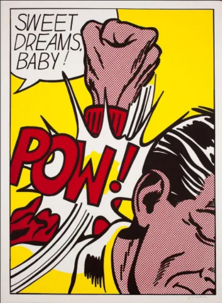
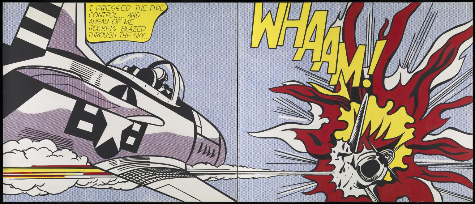
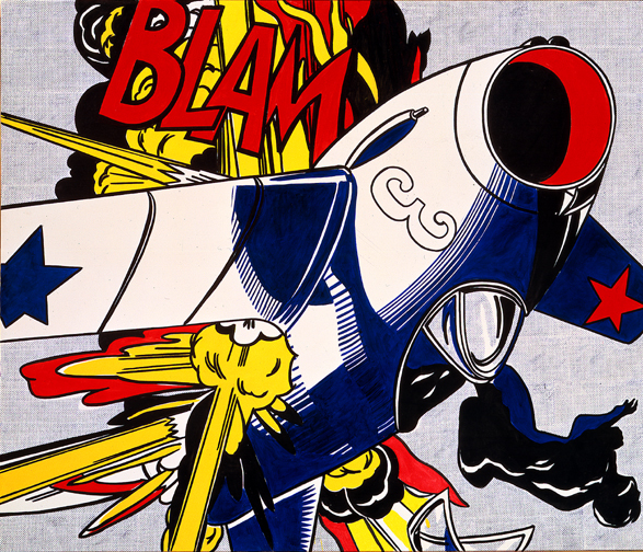
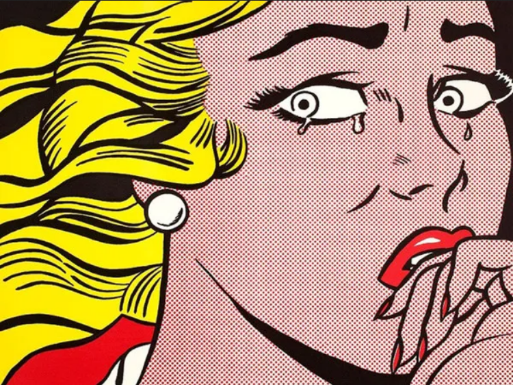
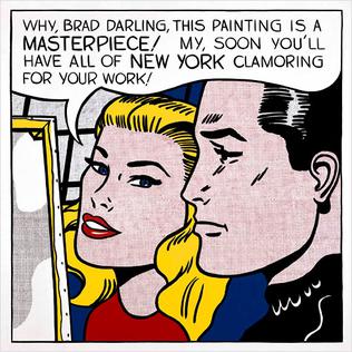
Pop Art is an artistic movement born during the mid- to late- 1950s in the United Kingdom and the United States, then spread in Europe during the 1960s. This Popular Style is inspired by concrete representations of the mass culture, such as comic books, advertising, and mundane mass-produced objects. Since Pop Art was heavily influenced by the comic style, We decided to take as a reference point the artist that during this period used the comics as a source of imagery and inspiration more than any other: Roy Lichtenstein. We wanted to recreate a comic observing the painter’s style and exaggeration elements: only primary and eye-catching colours are used, no shadows are included, no blending apart from the ben-day dots employed to create subtle colors differences in comics, the use of heavy black outline, and the integration of text into the image where sentences sometimes go out from the margins.
Fonts
The font used in Lichtenstein’s bubbled speeches is the Std Regular. Since the font costs 20$ on the web, Fontspring suggested some similar alternatives: We chose the P22 Pop Art Comic Regular and the P22 Pop Art Comic Bold Italic for the text and subtitles respectively. For the titles and blockquotes, We wanted a similar font to the one present in “POW” by the artist. We found BadaBoom BB as a good alternative, also in line with the Comic Style.
Layout
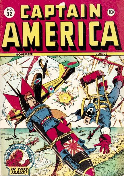
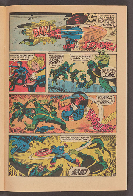
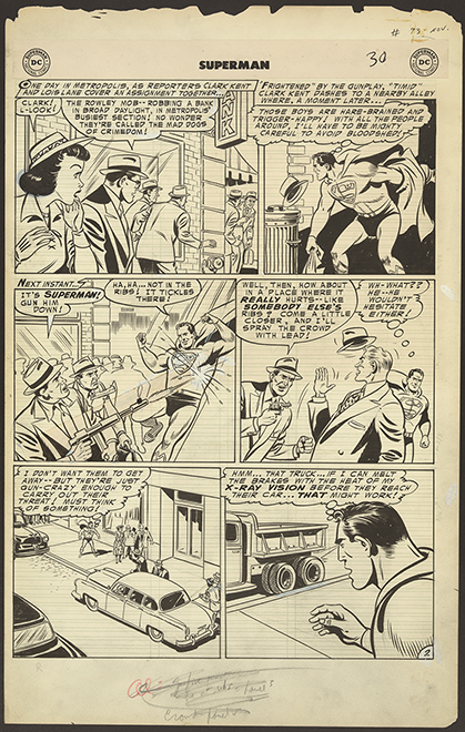
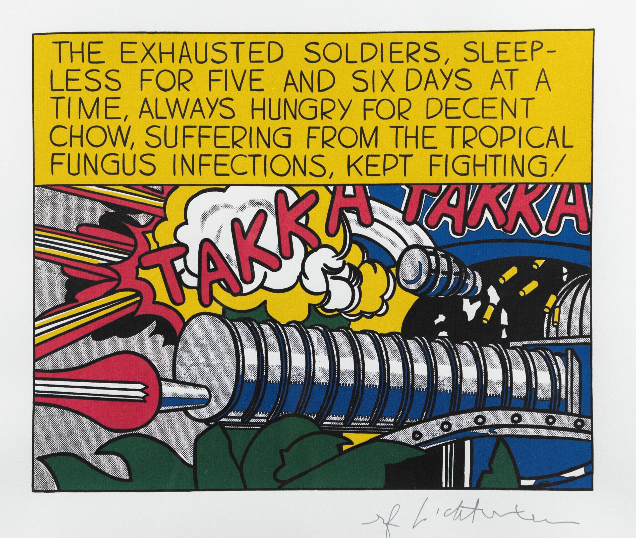
We created a header that could be similar to a comic heading like the one in Captain America's cover, just to present the journal. In this context, the colors are the same used in the “POW” work in terms of chromatic levels, enriched by the clouds’ border, recurrent element both in Lichtenstein paintings and American comics of the 60s. According to the comics schema for narration, we tried to reconstruct the perception of block’s reading through the division of each paragraph into two columns. The white container in which the articles are included aims to create some margins between the paper area and the live area as the sources show, same as of the images with the text, represented with margins and heavy black outline. Some parts of the articles -such as blockquotes or images captions- are represented as they were part of speeches into round white containers, while the subtitles are marked by rectangular yellow shapes, as the above text in “Takka Takka”. Here are the comic sources that we used as a reference and that maybe inspired Lichtenstein in his following works’ creation.
Colors
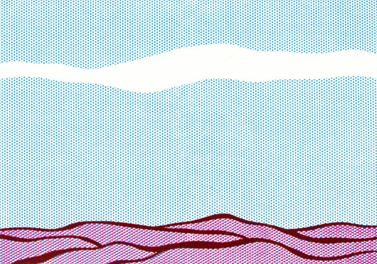
We tried to observe both the Lichtenstein style and the colors of the comics of that time, balancing them to enable legibility and to give a perception of advertising, exaggeration and vivacity.
Here are the most inspirational art works from which we extracted the chosen chromatic range:
1990s style: Cioè magazine
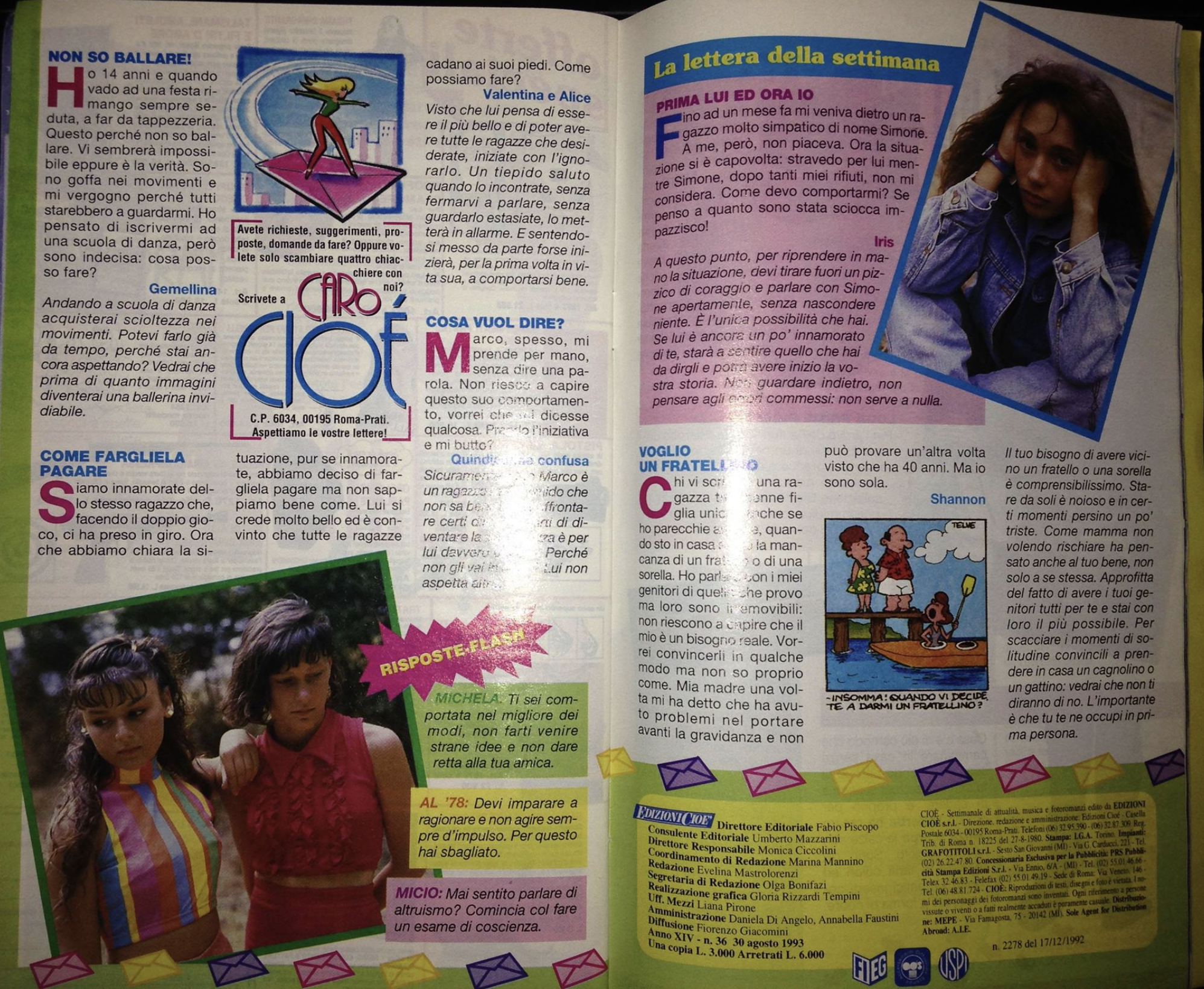
For the style about the last decades of XX century we thought to reproduce the typographical choices of Cioè, a famous Italian teen magazine, still in print nowadays.
It had its biggest spread during the eighties and nineties and is a weekly magazine published in Italy since October 7th, 1980, currently published by Edizioni Panini. The magazine is mainly addressed to adolescent and pre-adolescent audience and deals with issues related to fashion, music, cinema, gossip, love and sexuality.
It is printed in a small format and is characterized by really colored articles and front pages. It came usually with attached gift posters of famous people.
Here are some images that we used for taking inspiration on the layout.
Cover page
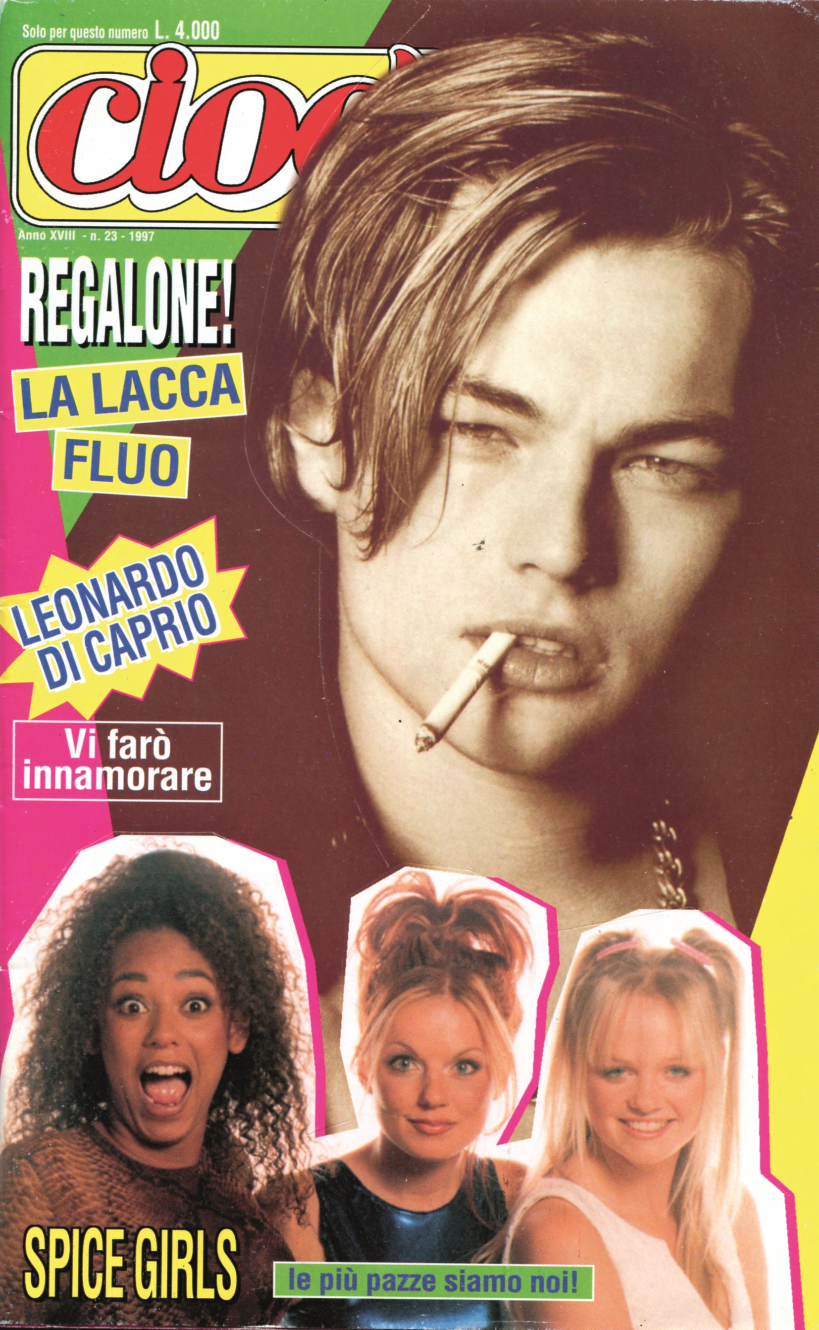
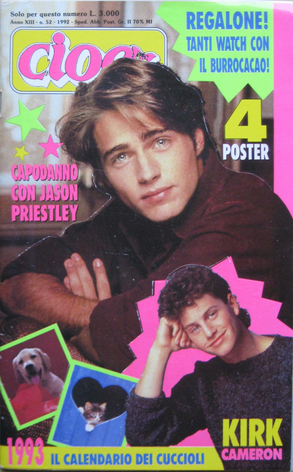
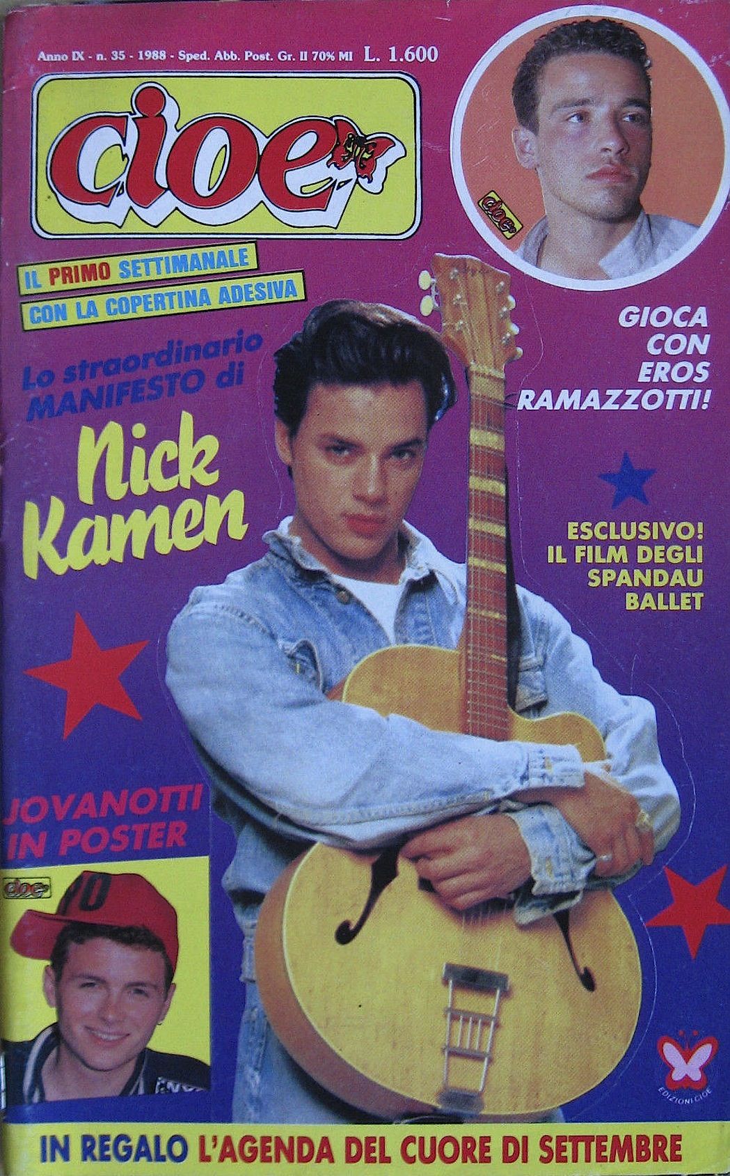
For the home page we decided to create a cover that followed this really colored style with superposing images of people of different dimensions over a geometric background and the same style was adopted with images of us for the page of the carousel devoted to the team.
Layout
In the Journal page each article was divided into two columns for recreating the format of the magazine: each "p" tag was split in order to make it more readable and to avoid re-scrolling all over the page.
We added rotated images decorated with a colored border and a lot of different containers of various colors for imitating the bustling flow of the content inside the page, scanned by different boxes with additional content.
Every first letter of the paragraphs was enlarged and colored with fuchsia as the explicative image shows and the border of the journal page colored with a lizard green.
Colors
The idea was to remain mostly focused on the example palette of colors inside the images. Here the colors mostly used for this style.
Fonts
Trying to be as consistent as possible we also got in touch with the social media manager of the current magazine, trying to ask for some information on the archive of the 90s due to the lack of images of the journal pages and the related fonts. They answered providing some of the used typographic fonts at the time and explained also that the logo was designed specifically by one of the graphics at the beginning and that wasn’t inspired on any existent font.
 The decision for the logo of our journal was to use one of the most similar one and using some shadow to give it the double border of the original one. The font used for the title of the cover page is Hidden Cocktails Italic Shadow.
Concerning the provided list of fonts we decided to use the Helvetica font with a lighter font weight, because it was the only one also close visually with the reference image we had to work on. The cited one in fact were: Mistral, Futura, Futura Extra Bold, Helvetica, Helvetica Compressed, Helvetica Cond Bold Obliq and Rundfunk.
Concerning the uppercase titles of the journal page, we chose one of the most similar font basing on the reference image, shown in the documentation: Archivo Black with a lighter font weight and transformed in uppercase, both for titles, subtitles and first letters of each paragraph.
The idea for the cover page of making a collage of the most famous "food scenes" coming from cinema and tv series resulted by the witness of reproducing the colorful '90s covers from Cioè magazine, with superimposing figures of different shapes and sizes.
For some uppercase titles and for the navbar we decided to use Rampart One which was the most similar for titles such as the one of the Spice girls in the cover, because of its borders and style.
Navbar
For the navbar buttons the idea was to replicate the rounded yellow rectangle of the famous cover page for each of the buttons, in order to render the magazine identity and make it more recognizable both on the issues and on the cover page.
ImmerSeave futuristic style
The idea for this style comes from our vision that the future will be using immersive technologies. We see it happening recently with the launch of the Metaverse and the development of 3D, 4D and more D technologies. So, the idea for this style is to let the user be transported in the sea and enjoy the reading of the articles while peacefully listening to the sound of the waves. To add a layer of realism, we created a “storm” option to agitate the sea and sounds and therefore recreate the environment of a seastorm. The css code for the rain is inspired by Amit Ghosh, accessible on this link.
Fonts
We used the fonts Montserrat, Monserrat Alternates Regular and Montserrat Italic for the text, Shadded South for the titles and Aerovias Brazil for the subtitles.
Layout
The welcoming screen prepares the user to the experience that follows, by introducing the sound before having the visual of the issue. It is possible to skip it by clicking anywhere on the screen, if the user doesn’t want to wait 10 seconds. The articles are by default a little bit transparent, and get completely opaque on hover, as well as growing in size. That way, the user can fully focus on the current article they are reading without being distracted by other information on the screen. Images and titles also grow when hovered. The backgrounds are gifs images, to give to the user the feeling of a living and moving environment, in the middle of the ocean.
Colors
We used several gradients to give an overall futuristic style to the page, pleasant and relaxing to the eyes.
Navigation bar background
Navigation bar color 1 : Gold
Navigation bar color 2 : Silver
Article background
Title color
Shadow of the articles
Team
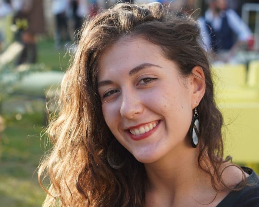
Alice Bordignon
I hold a Bachelor in Conservation of Cultural Heritage and Performing Arts Management at Ca’ Foscari University of Venice with curricula in Economics and Management of Arts and Cultural Activities. I am currently attending the DHDK master’s degree at Bologna University, and I am always hungry…. For knowledge obviously. I am passionate about design, web technologies, UX, and I have a keen interest in 3d modeling and XR tools for innovation in cultural industries.
During the project, I edited the Pasta issue, and I was responsible for the first mid-XX century and the 1960 typographic style. I dealt with the markup of my issue, the navbar and home page structure, the search box structure and its basic slide toggle functions. I cooperated for the implementation of some functions regarding the metadata viewer, using jQuery. In particular, I created the ones for the selection and highlighting of the instances and sections for the specific search and the selection and highlighting of the instances under the same class.
For this project we obtained balanced and synergic cooperation, always including each other in different types of choices, progresses and technical difficulties.
More information about the styles, the metadata and the markup can be found at the documentation page.
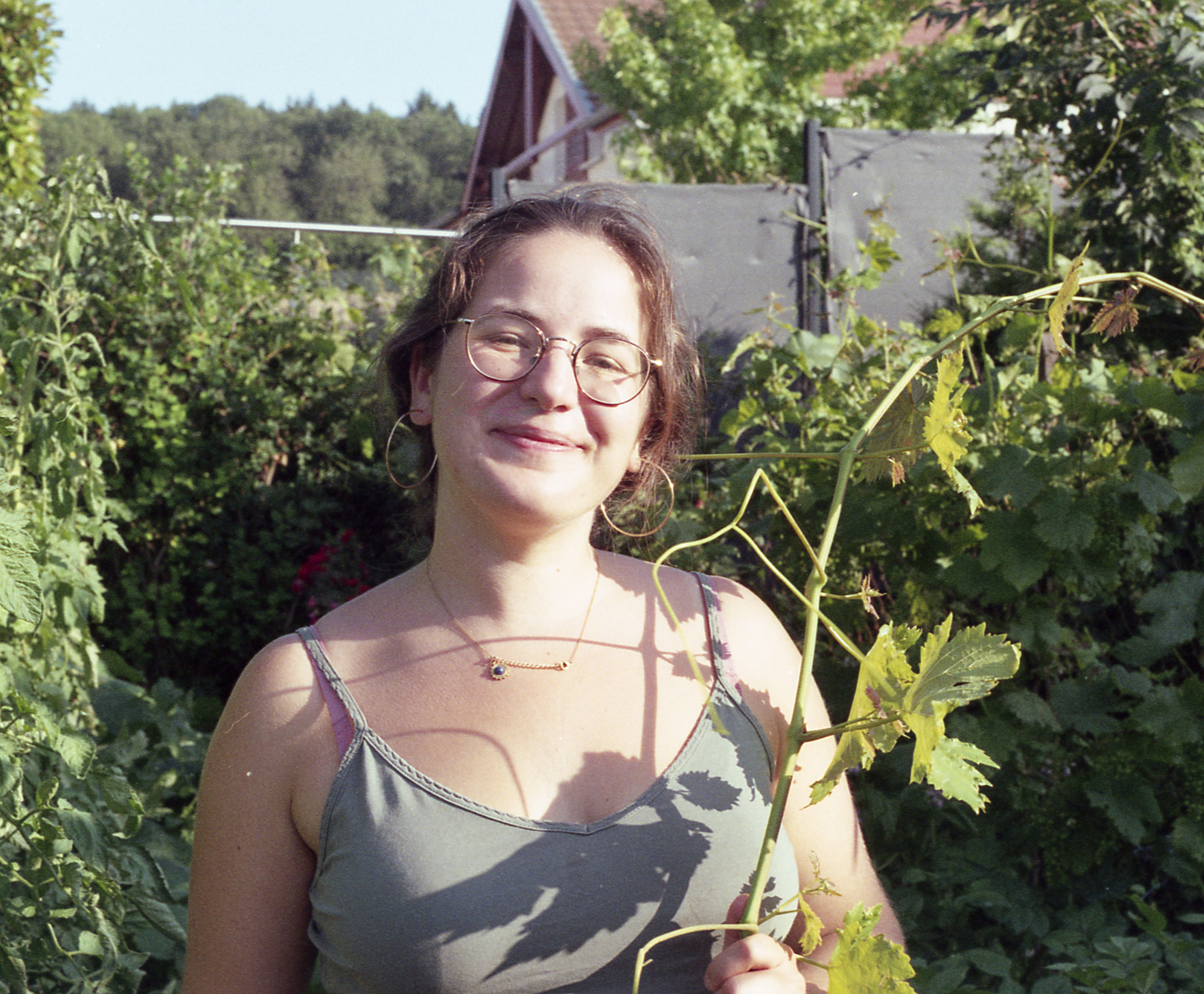
Constance Dami
After graduating in General History and Computer Science for the Humanities at the University of my hometown Geneva, I am currently attending the Master's Degree in Digital Humanities and Digital Knowledge at the University of Bologna. I came to Italy to learn everything about Digital Humanities, but also for the amazing food, obviously! My main interests are programming, web development, digital libraries/archives, and data extraction and organization.
For this project, I was in charge of the Ice Cream issue, as well as designing the Medieval and futuristic ImmerSeave styles. I wrote the functions taking care of the navigation of the website and the switches of style through the buttons on the navigation bar. I also contributed to some of the searchbox functions, such as accessing sections of the articles, scrolling to an element in the text by clicking on the searchbox and vice-versa, as well as adding a button for scrolling back to the top of the page. I also created a little python function that was useful to us for retrieving our markup and insert it in the searchbox panel, accessible on our GitHub repository. For this project we obtained balanced and synergic cooperation, always including each other in different types of choices, progresses and technical difficulties.
More information about the styles, the metadata and the markup can be found at the documentation page.
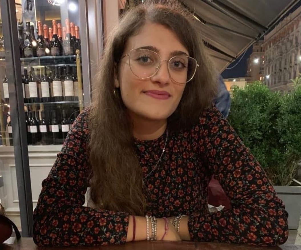
Giulia Menna
I graduated in Humanities, Modern Curriculum, at the university of Milan and I am currently attending DHDK Master’s degree at the University of Bologna. I’ve been for so long mainly a Literature enthusiast, but now my personal interests expanded to Computational Linguistics, Natural Language Processing, Web technologies and, last but not least, to cooking experiments!
For the implementation of The Daily Meal I was in charge of marking up and adding metadata on top of the Hamburger Issue. I worked on the XIX century and 1990 typographic styles, for whom I developed a stylesheet reproducing the Belle Époque period and the ‘90s Teen magazine with a special focus on the Italian magazine Cioè.
I realized the Javascript function for the disclaimer and some of the functions for the metadata viewer, using Jquery: such as the selection of simple metadata, their highlighting and de-highlighting process and the function for hiding articles and disabling their checkboxes.
For this project we obtained balanced and synergic cooperation, always including each other in different types of choices, progresses and technical difficulties.
More information about the styles, the metadata and the markup can be found at the documentation page.
.jpg)
